
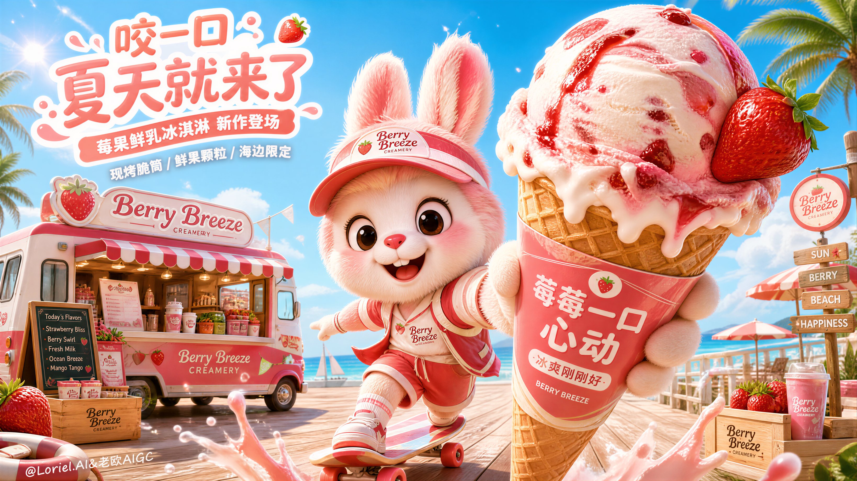
🍦品牌 IP 最有价值的时刻,不是站在产品旁边卖萌,而是让它成为用户进入品牌世界的向导。 ★ oversized product in foreground, mascot in motion 冰淇淋必须先勾起食欲,IP 再用跑、滑、递出的动作把视线带向产品。主次清楚,角色才不会抢戏。 ★ truck, menu, packaging, costume share one system 从冰淇淋车、纸套到角色制服都使用同一套草莓粉、海盐蓝和圆润图形。IP 不是一个角色,而是品牌的视觉管理员。 ★ branded destination instead of generic backdrop 海边、门店、货架和路牌共同组成“莓果冰淇淋的夏日目的地”。用户记住的是一整个可以抵达的场景。 ★ one emotional slogan, many physical touchpoints “咬一口,夏天就来了”不只写在画面上,它被冰淇淋、海风、阳光、角色和冰淇淋车一起演出来。 真正可持续的品牌 IP,不是给产品增加一张脸,而是让每个触点都像来自同一个快乐世界。 GPT- image 2 prompt👇 Create a premium flagship Amazon-style hero sales poster for a self-created ice cream brand, strictly preserving 100% of the original composition logic, camera perspective, mascot placement, oversized foreground product framing, beach boardwalk setting, and dynamic playful motion of the reference image. Do not redesign the macro structure. Keep the exact visual framework: a bright sunny seaside boardwalk, one large mascot-like 3D character occupying the center, one oversized ice cream cone pushed very close to the camera in the right foreground, a branded ice cream truck in the left-mid background, and splash-motion elements across the lower foreground. This version must combine stronger Orbit-level appetite impact, deeper Port-level summer-world storytelling, and a more stable, mature flagship-brand identity. Style direction: premium feature-animation 3D aesthetic, Disney-Pixar-inspired charm, polished family-film quality, clean rounded modeling, transparent warm sunlight, soft layered rendering, elegant cartoon realism, healing and playful premium commercial mood, no anime style, no cyberpunk, no gritty realism, no cheap toy render, no muddy texture stacking Brand direction: self-created premium ice cream brand brand name: Berry Breeze Creamery brand personality: cheerful, premium, sunny, playful, beachy, flagship-grade, collectible, highly branded, mature but cute brand system: strawberry pink, creamy vanilla, coral red, ocean blue, waffle beige, bright sky blue, fresh green accents, rounded premium typography, polished seasonal retail identity Core composition: keep the exact beach-boardwalk composition unchanged. The right foreground must be dominated by one giant ice cream cone held extremely close to the lens as the primary appetite and commercial anchor. The center foreground must feature one original mascot-like 3D character in an energetic running or skating pose, smiling directly at the viewer. The left-mid background must contain one premium branded ice cream truck. The lower foreground must include lively splash or motion elements. Palm trees, blue sky, parasols, deck texture, and sunny beach atmosphere must remain clearly visible, preserving the same exaggerated wide-angle hero structure. Orbit enhancement: push the right-foreground cone even closer, larger, colder, and more delicious. Strengthen the readability of the strawberry marbling, fruit gloss, creamy melting edge, waffle texture, and branded cone sleeve so the product hits instantly at first glance. The cone must feel like the absolute hero of the image, with maximum “bite now” desire and premium frozen freshness. Port enhancement: expand the image into a fuller “seaside ice cream flagship world.” The mascot is not only presenting a cone; it is the cheerful host of a branded summer paradise. The truck becomes a flagship dessert station, the boardwalk becomes a stage for a seasonal ice-cream celebration, and the splash, sunlight, breeze, parasols, and palm silhouettes all work together to suggest a complete brand universe. The image should feel like one key frame from a larger flagship story about joyful summer indulgence. Flagship maturity: everything must belong to one mature premium brand system. The mascot costume, cone sleeve, truck signage, menu board, parasol colors, packaging accents, logo treatment, and environmental tone must all feel designed by one professional flagship brand team. Remove any toy-like or overly childish randomness. The full image should feel stable, polished, coherent, and top-tier commercial. Main subject 1, oversized hero ice cream: the giant cone in the right foreground must be the core sales object. It should be an ultra-premium strawberry-and-cream ice cream cone with one large textured scoop, visible berry swirl marbling, fresh strawberry garnish, glossy fruit highlights, creamy melting edges, detailed waffle cone texture, and a clean branded sleeve. Re-create all product text from scratch: Main Chinese title on sleeve: 莓莓一口心动 Secondary Chinese line: 冰爽刚刚好 Small English line: BERRY BREEZE The cone must feel cold, luscious, tactile, photogenic, and instantly crave-inducing. Main subject 2, mascot character: create one original signature mascot-like 3D character with soft plush fur, oversized expressive eyes, rounded face, playful smile, premium summer outfit, and collectible flagship-IP charm. The character may be bunny-like or fantasy-creature-like, but must be clearly original and not tied to the reference branding. It should feel friendly, energetic, and iconic, with one arm presenting the cone and the body posed dynamically as if skating or dashing toward the viewer. Motion and anatomy must feel balanced, adorable, and premium. Background vehicle: preserve the exact ice-cream-truck logic in the left-mid background. Redesign it fully into the Berry Breeze Creamery brand system, with striped awning, premium menu board, rounded retro-modern body shape, matching summer signage, and integrated packaging display. It should feel like a flagship mobile dessert station, not a generic van. Environment: preserve the sunny boardwalk and beach-retail atmosphere. Show palm trees, clean deck boards, parasols, warm sun reflections, soft ocean hints, airy sky, and a bright summer leisure mood. The environment must feel premium, cheerful, and clean, with no clutter and no dirt. Product ecosystem: integrate the hero cone, mascot costume, truck branding, menu signage, cone sleeve graphics, packaging, and summer props into one complete and mature flagship brand system. Everything should support the same summer-dessert story and brand universe. Typography and recreated title system: add a premium Chinese main title and refined supporting copy in the upper breathing area or integrated into the truck/scene signage. Suggested title: 咬一口 夏天就来了 Subtitle: 莓果鲜乳冰淇淋 新作登场 Support copy: 现烤脆筒 / 鲜果颗粒 / 海边限定 Typography must feel rounded, premium, playful, and art-directed, with no crude black fonts and no cheap ecommerce styling. Lighting and effects: bright warm sunlight, soft ocean bounce light, transparent ice cream sheen, refined berry gloss, subtle splash droplets, soft glow particles, gentle motion blur accents, premium highlight roll-off, clean shadow edges, polished cinematic beach-store atmosphere. The whole image must feel bright, joyful, soft, and flagship-level. Material quality: soft mascot fur, creamy ice cream texture, glossy strawberry skin, crisp waffle cone pattern, painted truck metal, striped fabric canopy, polished accessories, refined wooden deck texture, high-end 3D material definition throughout. Everything should feel expensive, rounded, and clean. Color palette: strawberry pink, creamy white, waffle beige, coral red, sunlit gold, sky blue, ocean blue, fresh green accents. The full image must feel transparent, youthful, premium, stable, and highly memorable. Commercial objective: make the image feel like a top-tier flagship Amazon hero visual for a premium ice cream brand, where the giant cone, mascot IP, and seaside flagship truck world work together as one polished summer commercial universe with stronger appetite appeal, stronger IP storytelling, and stronger brand maturity. Negative prompt: copied original text, watercolor texture, ink-wash, ancient Chinese style, gritty realism, anime style, cyberpunk, cheap toy look, dirty beach, crude fonts, distorted hands, broken anatomy, malformed mascot, muddy colors, harsh shadows, low-end 3D render, cluttered composition, noisy texture stacking, inconsistent brand elements

· 568 Views